
Reading and understanding Tachogram charts
Last updated: 14.Mar, 2022 13:35
Using a digital tachograph is an integral part of the drivers work. It provides a lot of information to both the drivers and their managers and it’s crucial to understand all the data you’re getting from it. Whether you have been using Tachogram for a while now or are about to start, a simple explanation on what data can you see and what do all the charts in the system mean, may help you to better plan your work and avoid violating the EC regulations.
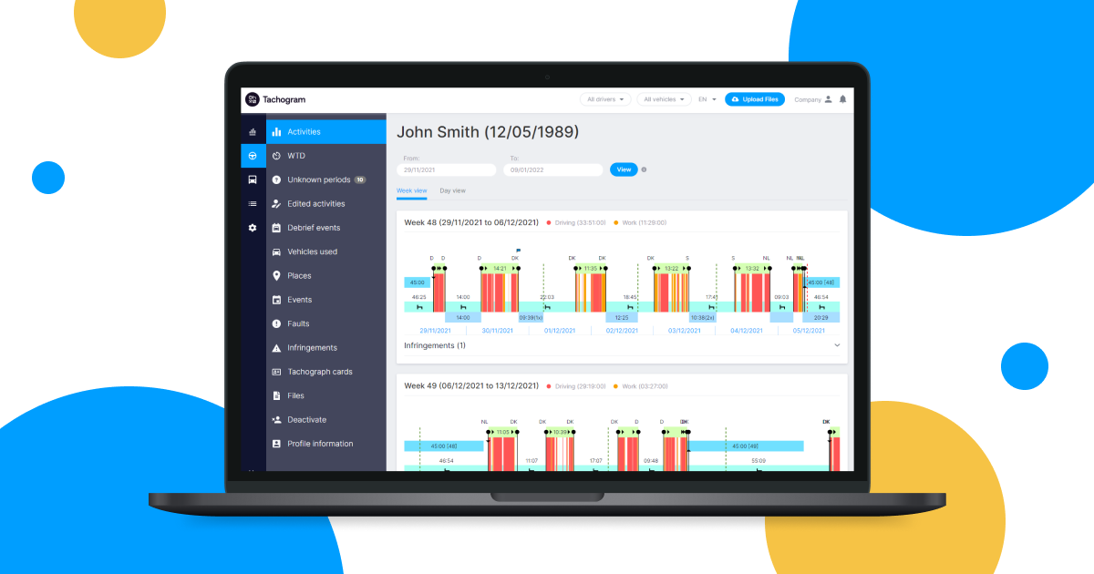
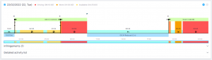
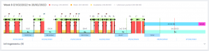
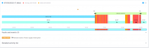
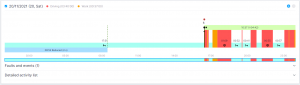
Basic activities recorded by tachograph is the central element of the Tachogram charts and can be seen both in the website and mobile application. Each type of activity is displayed using a different colour:
● Driving - red;
● Work - orange;
● Availability - yellow;
● Rest - light blue.
Rest periods
In addition to basic activities, Tachogram also displays interpreted activities on the charts. The resting periods that are identified as daily and weekly resting periods are also displayed:
● The daily resting periods are displayed in a different shade of blue just under the charts. For your convenience the reduced daily resting periods also include the number of reduced rests used in that specific week;
● Weekly resting periods are displayed in the central part of the charts, using a shade of light blue colour;
● Another topic to be discussed in some of the next blog posts is the reduced weekly rest compensation times. They are shown in violet colour and located at the same level as weekly resting periods.
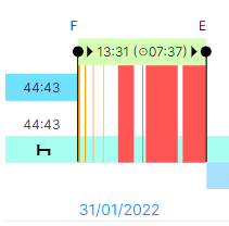
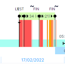
Daily working period
Daily working period is displayed on the top of the charts in light green colour. Due to the fact that in most cases you need to understand your daily driving time, this information is also included in the green zone. Additionally, this block contains information about shift start and end countries, which are represented by ●► and ►● symbols, the same way they're used in tachographs. Also, you can see the abbreviations of the countries where the daily working period started and where it ended on top of the green bar.
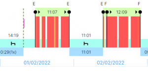

Vertical dashed lines
You will notice dashed green and red vertical lines in some parts of the charts . The green lines represent the 24 and 30 hour periods after the start of the daily working period. These lines can easily help you understand why your daily resting period was cut off at some specific point. The red lines represent the end of 6 x 24 hour periods, after which you need to have the next regular or reduced weekly resting period.
Crew driving status
Crew driving status is represented by either one or two black horizontal lines on the charts. If your card is inserted in the driver slot and you are driving in a crew, one black line is added to the chart. If your card is inserted in the co-driver slot, two black lines will show in the charts. There are some situations when having this information in the charts allows you to better understand what has happened with the vehicle in particular situations.
Events
● Driver card insertion - a black, thin vertical line with an arrow facing downwards;
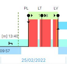
● Driver card withdrawal - a black, thin vertical line with an arrow facing upwards;

● Daily working period start - ●►;

● Daily working period end - ►●;
● Ferry/Train crossing - ~ character;
● Events registered by tachograph - black exclamation marks on yellow background;
● Faults registered by tachograph - black exclamation marks on red background.
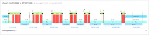
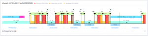
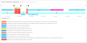
Infringements
Finally, we have reached the most interesting part - the infringements. They are displayed as coloured flags on the top of the charts:
The blue flag represents a minor violation;
Yellow flag – a serious violation;
Orange flag – very serious violation.
Red flag – most serious violation.
We both hope and wish you'll never have to see a red flag in your graph! All of the violation severities are categorised according to EC regulations.
As you can see, there is a lot of useful information Tachogram provides to ensure your safety on the road and compliance to international regulations. If you’re using our mobile app on a regular basis, you’ll notice that it doesn’t have as much information available as the online version has. The app will show you the most important things you need to see while being on the road, such as remaining driving time, rest times, activities, your driver card downloads. The full data analysis can be accessed on your profile at Tachogram website at any time you wish. However, if you still need some assistance or advice on how to read your Tachogram charts, don’t hesitate to contact us.
If you haven't tried Tachogram yet, sign up for a free trial!


